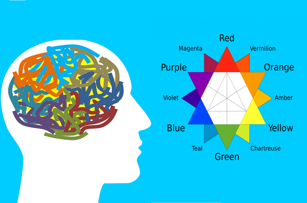
In the past century, marketing has become a vital and integral part of any successful organisation, with many businesses investing heavily in their brand development and design. Colour psychology has emerged as a key influencer and marketing tool for companies serious about influencing buyer behaviour.
Why do we use colours in marketing?
Colours help your product stand out from the competition. Customers associate colours with past experience, events, cultures and it is a powerful trigger for emotion.
What do different colours imply?
- Red – power, passion, anger, danger.
Stimulates appetite, which is why it is frequently used in fast food product advertising. Can also create a sense of urgency. For example, Coca-cola, Netflix, H&M. - Orange – generates a feeling of warmth as it’s associated with the sun.
Warmth, friendliness, energy. Look to Easyjet, Orange, Amazon, TNT. - Yellow – youth, sunshine, happiness.
Shades can be difficult for the eye or look “dirty”, but the contrast with a darker colour emits a powerful message. Companies that use yellow include McDonald’s, DHL, Post It, Hertz. - Green– health, nature, prosperity.
Easy for the eye to look at and process, encourages thoughts and associations with health, nature, prosperity. A popular colour with whole foods producers, Land Rover, Perrier, BP.
- Blue – calming, tranquility, wisdom, logic, also cold, emotionless.
Known as an appetite suppressant (can you think of any naturally blue foods?)
Shades of blue are used extensively by Facebook, Ford, Paypal, Allianz, Nivea. - Purple – superiority, wisdom, wealth, previously the colour of royalty.
The best example we can think of mid-afternoon as we prepare this is the rich purple wrapper of chocolate brand, Cadbury’s! - Black – luxury, power, security, sophisticated.
This colour works well in some industries such as fashion. It is less suitable for other industries/products, for example, healthcare, as it reminds people of death! - White/Silver – clean, modern, sleek, sterile, plain.
Can look modern and sleek, but if designed poorly will look lazy and plain.
Great examples include Apple, Tesla, Prada, Sony.

Colour psychology in marketing is continually developing, recently companies have been moving from primary to tertiary colours to further stand out and be unique. In addition more consideration has been taken to cater for the needs of the client, for example, a colour blind consumer cannot easily perceive red or green colours and as a result, some brands have chosen to stay away from these colours to avoid alienating the customer.
Two fun colour facts
Facebook has blue branding as Mark Zuckerberg is colour blind! Recent studies have also shown that men and women perceive colour differently leading to brands to adapting in accordance with their target market – men react to strong bold colours, whereas women prefer tints.
Now you have your colour scheme sorted – what’s the best paper to use?
For magazines, flyers and business cards we recommend using C2S paper.
For pages where you wish for the image to be the main focus, a gloss finish will be eye-catching and draw your customers attention. However, if you wish to draw attention to any text, a silk or matt finish will be more suitable.
PG Paper’s multilingual business development team would be delighted to discuss your paper requirements for all of your projects. We can offer regular paper deliveries for ongoing project requirements as well as satisfying your requirements for one-off projects too. And with PG Paper’s in-house specialist teams covering sales, finance and logistics; your peace of mind is guaranteed! Make your initial enquiry today by emailing the team at info@pgpaper.com


